Preprint · 2026

TerraNova

A Foundation Model for the Anthropocene

We trained a single model on 1,024 records of the Earth and of human societies, without forcing either into the other's shape.

  1. 1Department of Management, Economics and Industrial Engineering, Politecnico di Milano
  2. 2RFF-CMCC European Institute on Economics and the Environment (EIEE)
  3. 3Euro-Mediterranean Center on Climate Change (CMCC)
Preprint PDF, 2.3 MB Supplementary PDF, 6.3 MB arXiv soon Code & weights upon acceptance
  • 1,024 variables in one model
  • 512 gridded Earth-system fields
  • 512 national indicators
  • Minutes to add a new variable on a laptop

Overview

One planet, two kinds of data

The physical Earth is measured as continuous fields. Temperature, rainfall, soil moisture and vegetation vary smoothly from one place to the next, and they take no notice of political borders. Human societies are recorded a different way: one number per country per year for income, health, energy use or the quality of institutions. Almost every model is built for one of these two shapes. Joining them usually means averaging a field inside each country's borders, which erases everything that varies within it.

TerraNova is a foundation model: one large model trained once on a lot of data, then reused for tasks it was not specifically built for. We trained it on 1,024 records at the same time, 512 gridded Earth-system fields and 512 national indicators, and we left each record in the shape it was measured in. What the model learns is a representation, a list of numbers for each place, country and year that summarises everything it has picked up about them.

Because both kinds of data share that representation, the model can move between them. It draws a map of the world it was never shown. It fills in a global field from a handful of scattered measurements. It takes one number per country and writes it back onto the grid. Every answer arrives as a predictive distribution, a best guess plus a range that says how confident the model is. Teaching it a new variable takes minutes on a laptop.

Read the abstract from the paper

A defining problem of the Anthropocene is to model the physical Earth and human societies as one coupled system, yet no learned representation spans their observational breadth. We argue the obstacle is geometric: the physical Earth is measured as continuous fields that ignore political borders, whereas societies are reported for administrative units. Earth-system foundation models serve the first geometry; coupling it to the second has required lossy averaging over borders. We introduce TerraNova, a foundation model trained on 1,024 physical and societal records in their native geometries: 512 gridded Earth-system fields and 512 national indicators. Dedicated encoders represent location, country, time and task, cross-modal transformers fuse them into a shared spatiotemporal state, and a hypernetwork generates a per-query decoder whose evidential head returns a predictive distribution. Two contrastive objectives couple the representation: a population-weighted alignment between each country and coordinates in its territory, and one to pretrained geospatial embeddings carrying image-derived semantics. Read out through that decoder, the representation is competitive with purpose-built geospatial encoders while spanning axes they do not represent (time, oceans and uncertainty) and supporting country-level capabilities. The frozen backbone reconstructs dense fields from sparse observations and adapts to unseen variables in minutes on consumer hardware.

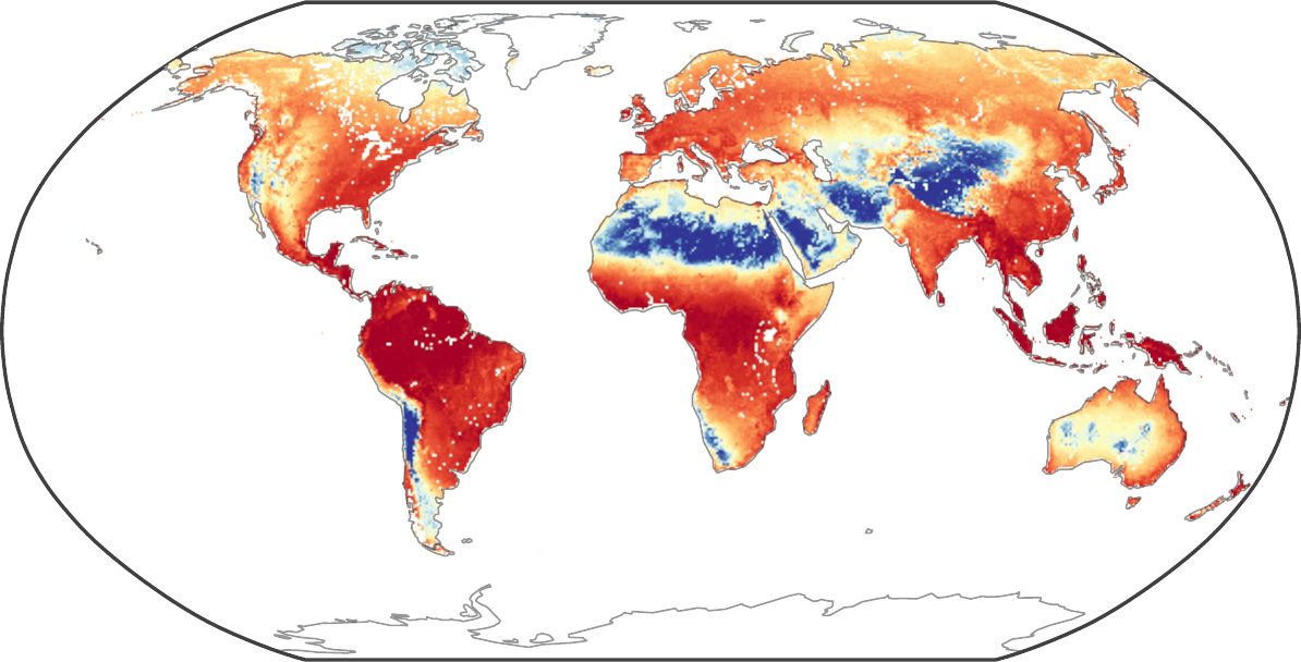
Left: the Earth measured as a continuous field. Right: the same region recorded as one value per country. Centre: TerraNova treats both as observations of the same reality, and encodes them into one shared space.

Contributions

What is new here

  • One model, two geometries

    To our knowledge this is the first model to learn a single representation across the observational breadth of the Anthropocene: 1,024 variables, from soil moisture to measures of democracy, in one backbone. Fields are never averaged over borders, and national statistics are never painted onto the grid.

  • The two geometries are coupled

    One training objective ties each country to coordinates inside its own territory. A second ties places to representations learned from satellite and ground imagery. Together they support things neither kind of data can do alone, such as naming the country a piece of territory belongs to, or turning a national statistic into a map.

  • It also covers time and the oceans

    Read out through its task-conditioned decoder, the representation leads purpose-built geospatial encoders on most static targets and most label budgets. It reaches axes those encoders do not represent at all: time, the oceans and uncertainty.

  • Uncertainty on every answer, cheap new variables

    Each query returns a predictive distribution instead of a single number, with separate proxies for noise in the data and for the model's own ignorance. New variables are reached with a small adapter, an add-on trained while the model itself stays frozen, at about 416,000 trainable parameters per task, in minutes on consumer hardware.

Method

How it works

TerraNova has four encoders, small networks that turn a raw input into a vector of numbers: one for location, one for country, one for time, and one for the task being asked about. A cross-modal transformer fuses location, country and time into a single spatiotemporal state, so that a place, a nation and a year are described in one common space instead of three separate ones.

A second transformer combines that state with the task. A hypernetwork, a network whose output is the weights of another network, then builds a small decoder on the spot for that specific query. The decoder returns a predictive distribution: a mean, plus proxies for the noise in the data and for how much the model itself does not know.

The four encoders feed a cross-modal fusion; a task-conditioned hypernetwork then generates the decoder for each query, whose head returns a full predictive distribution.

Results

What it can do

Six things we asked the model to do, and what came back. Open a tab, or read them in order. Every figure here is from the paper.

What the model learned about geography

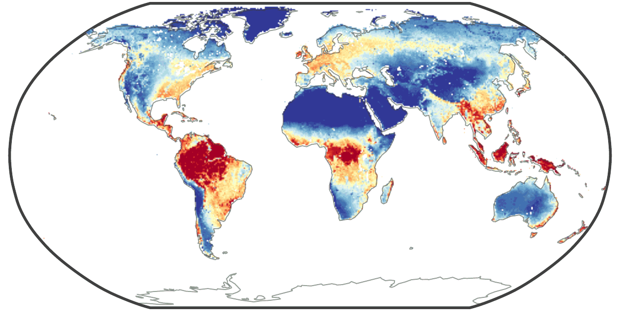
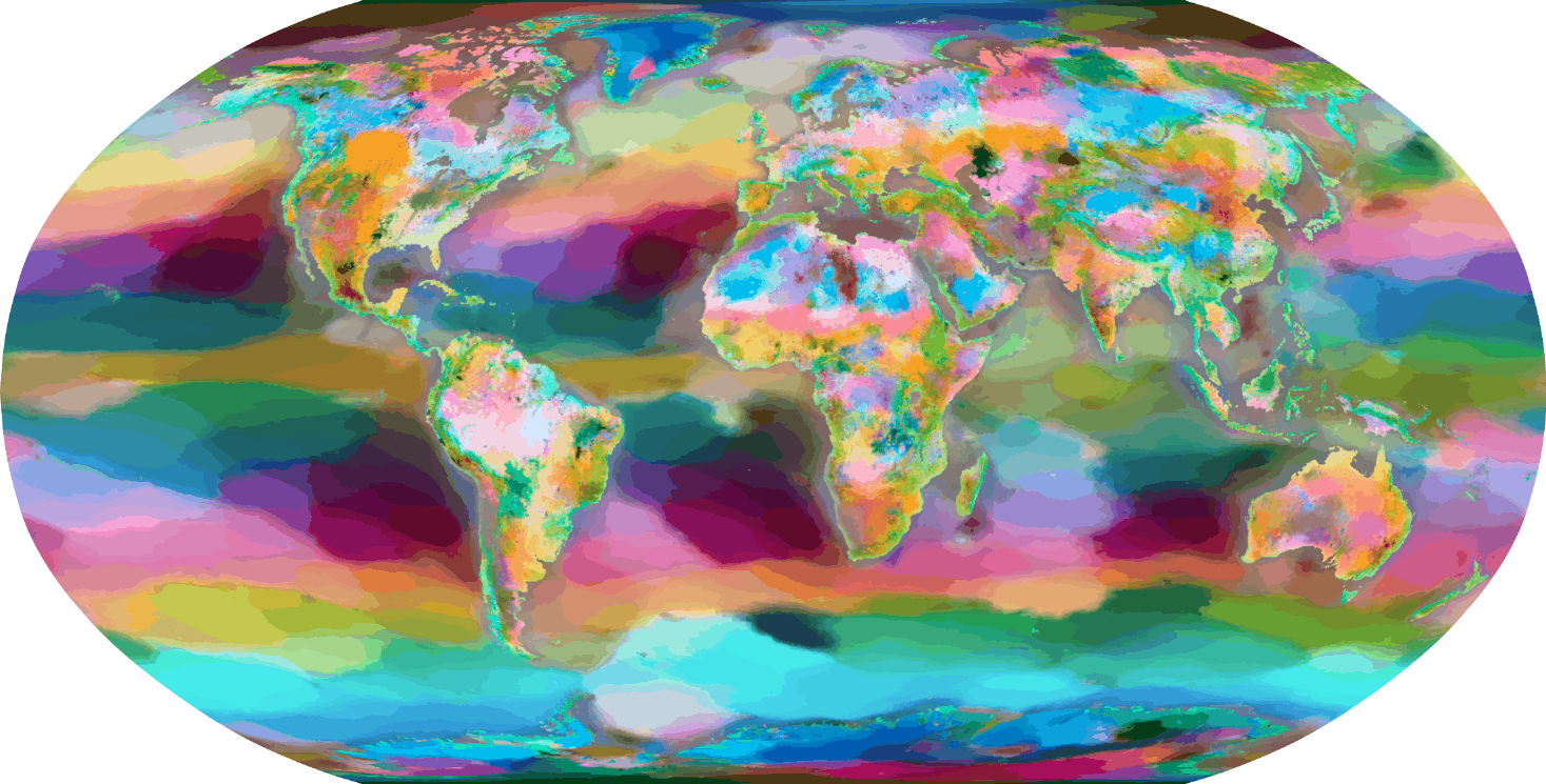
We coloured every cell of the globe by the model's location representation, squeezed down to three colour channels. Continents, mountain ranges, deserts, biome boundaries and coherent ocean basins appear. None of them was a training target. They fall out of learning to predict a thousand variables at once.

View
1.0×
The location representation painted over the globe, Robinson projection, reduced to three dimensions and mapped into colour. The full image is 4,034 pixels wide and loads when you open this tab. The same field over Europe, the Mediterranean and North Africa. This view comes from a lower-resolution source than the world map, so it stops zooming sooner, and the blocks that appear as you zoom in are the model's own grid cells rather than a compression artefact. A different encoder: one flat colour per country, from the country representation rather than the location field. The source figure prints its own title along the top edge. Drag to pan, scroll or pinch to zoom, double-click to zoom in. With the map focused, the arrow keys pan, plus and minus zoom, and 0 resets.
Against purpose-built encoders

We put TerraNova up against six published geospatial encoders on eleven targets none of them had seen, scored on held-out data, data kept aside from training. Its mean R2, the share of the variation a model explains, is 0.88 against 0.77 for the strongest baseline, and it is at or above the best baseline on every single target. The gap is widest at sea, where TerraNova holds R2 0.88 and encoders trained on imagery fall to 0.62 or below.

Held-out comparison against six published geospatial encoders, over six label budgets and three seeds.

Predicting past and present

We hid the earliest and the latest years of each national record, adapted the frozen model on what was left, and asked it to predict both ends. Across 29 indicators the mean short-range anomaly correlation, a score of how well the predicted year-to-year swings track the observed ones, is 0.74. Every trajectory carries a 90% interval, and that interval widens once the model is asked about years it never saw.

Held-out national trajectories of adult obesity, with recalibrated 90% predictive bands.

Dense maps from scattered measurements

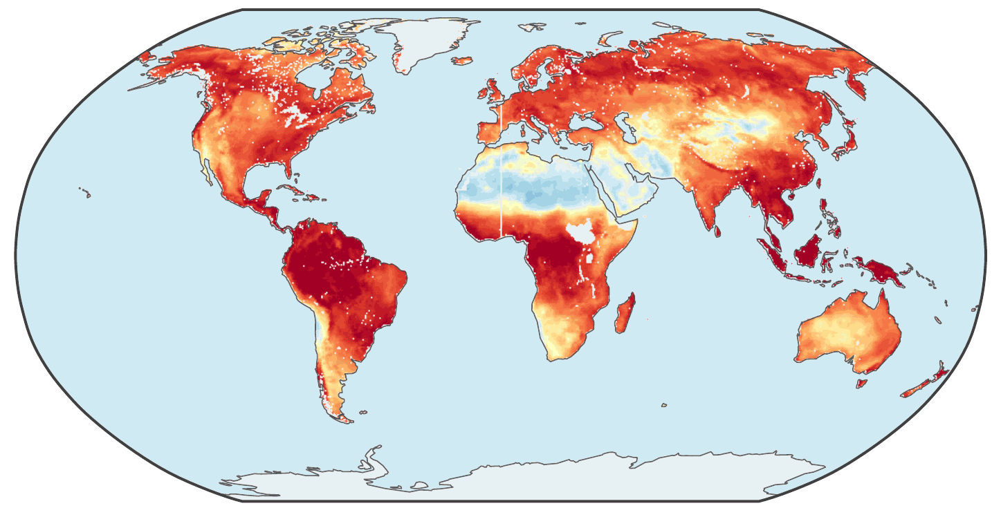
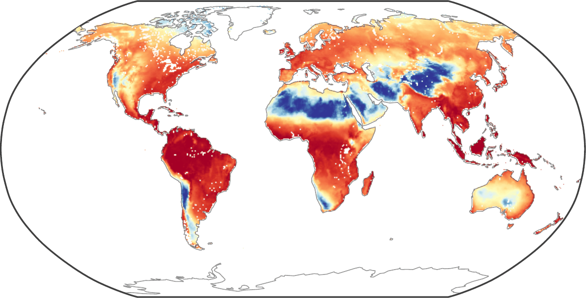
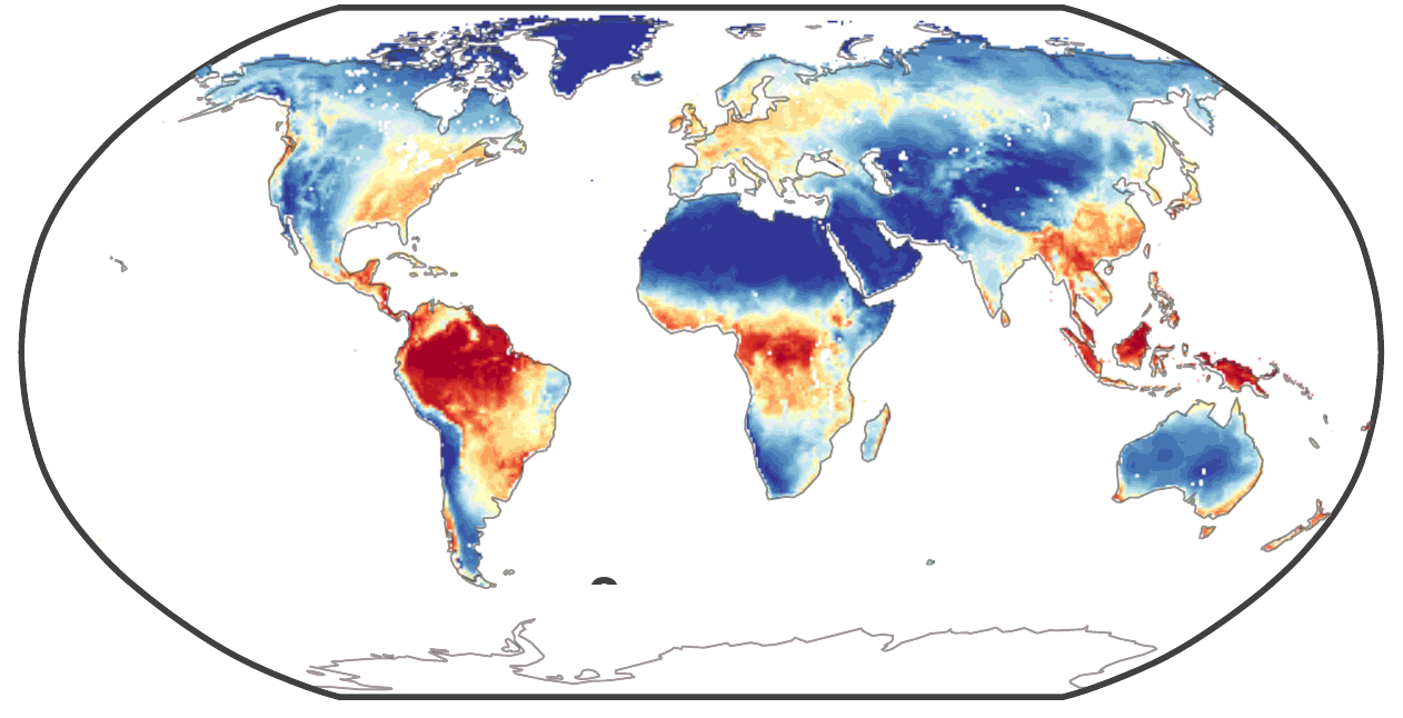
Give the frozen model a thin scattering of measurements of a variable it never saw in training, and it fills in the whole 0.25° grid. From roughly one measurement every eight degrees, the field shown here is recovered at a held-out R2 of 0.94. Classical interpolation falls further behind the thinner the measurements get, and unlike interpolation the model attaches a predictive width to every value it fills in.

TerraNova's reconstruction of the same global field, rebuilt from 238 measured cells: the large-scale pattern and the coastlines match the ground truth.
Ground-truth global field at 0.25 degree resolution in Robinson projection, coloured from blue to red.
Left: the ground-truth field. Right: TerraNova's reconstruction. Held-out R2 0.94, at a peak signal-to-noise ratio of 23 dB, rebuilt from 238 measured cells, one cell in 1,024. Drag the handle, or focus it and use the arrow keys.
The full figure from the paper: reconstruction quality and predictive width against measurement sparsity.

Where the model is uncertain

Because every query returns a distribution, we can map how wide that distribution is. The pattern follows difficulty rather than data coverage. It is widest where a field has strong structure, and narrowest over uniform places such as the Sahara and the open subtropical gyres.

Predictive uncertainty per domain, each standardised within its own domain.

From country statistics to maps

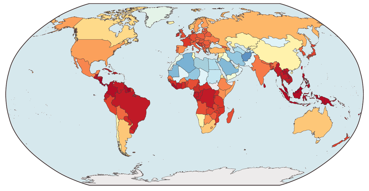
The link between a country and its territory can be read in the other direction. We hand the model one number per country and it writes that number back onto the grid. That is downscaling: turning one value per country into a value for every cell of the map, recovering structure the national average hides. On four biosphere targets the within-country correlation is 0.51 to 0.66, and it is positive in 91 to 96% of the roughly 150 countries scored. This is a capability of the coupled representation, not a validated product: it recovers nothing where a quantity barely varies inside a country.

TerraNova's gridded reconstruction of terrestrial productivity, produced from the national averages alone: within-country gradients, mountain ranges and coastlines reappear.
The input to the model: a choropleth of terrestrial productivity in which every country is filled with a single flat value.
Left: the input, one flat value per country, for terrestrial productivity. Right: TerraNova's 0.25° reconstruction, at a within-country correlation of 0.66. The gridded truth to compare against is the third panel of the paper figure below.
The full figure from the paper, including the gridded truth and the per-country correlation.

Full methods, the complete ablation programme, extended results and the cost analysis are in the Supplementary Information.

More results

Explore further

Six more sets of figures from the paper, most of them behind a control you can move.

One indicator, three kinds of year

The same fit as the Time tab above, read out over every country instead of eight. Adult obesity, one adapter fit on the years the record covers, then shown at three of them: a year inside the training window, a year before the record starts, and a year after it ends. Choose a year and a layer.

Year

Layer

Observed adult obesity, 2002, a year inside the training window. The observed and predicted layers carry a separate colour scale for each year, so changing the year on those two changes the scale as well as the year, and the maps cannot be compared by colour across years. The predictive width and error layers share one scale across the three years, so those compare fairly. The years are the figure's column titles; the map crops themselves carry no text.

Uncertainty, one domain at a time

These are the eleven small maps from the Uncertainty tab above, one at a time and large enough to read. The paper standardises the predictive width inside each domain and maps it. Grey is that domain's own average, orange is less certain than the average, blue is more certain. Because each map is scaled to its own domain, the eleven are not comparable with each other.

Domain

Vegetation. These crops are the map frame only. The colour bar, which the paper labels uncertain at the top, average in the middle and confident at the bottom, and the three regional strips that sit beside each map, are not part of them.

What the representation lines up with

These are the worked examples printed in the paper, not a live query interface. Nothing on this page runs the model. Pick one to see the figure and read the numbers it prints. City names are printed on the figures without spaces or accents; they are spelled normally here.

Example

Development axis. Countries projected on the direction the model learned between rich and poor. The figure prints an AUC of 0.98 and a rank correlation (written as rho) of 0.65 against GDP per capita. Highest: Puerto Rico, the United States Virgin Islands and Germany. Lowest: South Sudan, Burundi, and Sao Tome and Principe. Coastal or interior. The same construction applied to places instead of countries, projecting the location field on the direction between coastal and interior. The figure prints an AUC of 0.92, measured with the anchor points left out one at a time. Country analogy. Take the representation of Cuba, subtract Russia, add the United States, and look for the countries nearest the result. The figure prints the Philippines at 0.46, the Falkland Islands at 0.45 and the Faroe Islands at 0.43. Cities near Nairobi. The cities nearest Nairobi on its own similarity field, which is not the same as the cities nearest it on the ground. The figure prints Addis Ababa at 0.66, Bogota at 0.65 and Sao Paulo at 0.62. Income and life expectancy. The Preston curve, income against life expectancy across countries. The figure prints a rank correlation (rho) of 0.74 between the two quantities, and a cosine similarity of 0.44 between the two task embeddings, so the model places the two tasks near each other as well. Cities like Reykjavik. Cities ranked by how similarly they changed between 1980 and 2020, rather than by what they are like now. The figure prints Montevideo at 0.91, Edinburgh at 0.83, Dublin at 0.77, Helsinki at 0.75 and Munich at 0.75. Neighbours of inequality. The tasks nearest the Gini index in the model's task space. The figure prints gni per capita at 0.54, gdp per capita at 0.41 and hdi at 0.40. Neighbours of mixed forest. The same list for a land cover class. The figure prints vegclass enf at 0.53, vegclass wooded tundra at 0.42 and fertilizer nitrogen at 0.38, using the names as they appear in the training data. The axis against HDI. The development axis of the first card, plotted against the Human Development Index. The vertical axis is HDI; its label is cut off by the source figure's page box. The figure prints a Spearman correlation of plus 0.95. The bottom left points are labelled CAF, MLI and NER, for the Central African Republic, Mali and Niger. The top right labels overprint each other, and only Norway and Switzerland can be read.

From a few countries to all of them

Some indicators are reported by only a handful of countries. Here the adapter was fit on 32 reporting countries and then asked for every other country in the world. The four maps are the truth, the countries the model was allowed to see, its prediction, and how wide its predictive distribution is.

Indicator

Ground truth
Training data
Predicted mean
Predictive width

Meat supply per capita. The figure prints K = 32 reporting on the training map and r = 0.70 on the prediction. Tourist arrivals. The figure prints K = 32 reporting on the training map and r = 0.72 on the prediction. In the paper only the predicted mean and the predictive width carry a colour bar, and no colour bar is part of these crops. Read the four maps for pattern rather than for level.

Why the coupling matters

Two training objectives hold the two geometries together. One ties every country to coordinates inside its own territory. The other ties places to representations learned from satellite and ground imagery. The paper removes them one at a time and measures what breaks.

The country objective is what makes the two geometries addressable from each other. The variant that keeps it, and drops the imagery objective instead, names the right country for a coordinate 73% of the time and picks the right location for a country 95% of the time. The variant that drops it falls to 4% and 9%, against a chance level of 1 in 22, which is about 4.5%. Without the country objective there is no usable link left at all.

It is also what lets a national number become a map. On the four biosphere targets the paper downscales, removing the country objective flattens the within-country correlation to roughly zero, while removing the imagery objective leaves it clearly positive on all four. Panel b prints no numbers, so this is what the plot shows rather than a figure we can quote.

The imagery objective helps where its teachers looked, and nowhere else. The encoders it learns from were trained on land. Remove it and the frozen probe loses 0.149 in R2 across nine land tasks, every single one of them worse. The two ocean tasks move by 0.014, which the figure labels an off-support placebo: a check that the drop is the objective doing something real on land, not noise.

The alignment ablation from the supplementary material. Purple marks the model trained without the imagery objective, orange the model trained without the country objective.

Resources

Read the paper

Citation

BibTeX

A placeholder entry until the arXiv identifier is assigned.

@article{rodriguezpardo2026terranova,
  author  = {Rodriguez-Pardo, Carlos and Tavoni, Massimo},
  title   = {TerraNova: A Foundation Model for the Anthropocene},
  journal = {arXiv preprint},
  year    = {2026}
}

Thanks

Acknowledgements

Carlos Rodriguez-Pardo and Massimo Tavoni acknowledge support from the European Research Council, ERC grant agreement number 101044703 (EUNICE), CUP D87G22000340006.